When starting a new online business website, most of the time we would seek for web design services to develop a website for us. No doubt that the web designers can get your ideas and needs onto your website, but it is sometimes better for us (as a client) to know the basic to-do and not-to-do when developing and designing your website, to avoid unnecessary problems in future. In this article, I am going to list some of the web design mistakes which I think is best, not to be included into your website when you provide your ideas to your web designer.
1. Do not seek attention, but provoke it
Avoid being only an attention seeker – attention is never enough! The idea of your website should be in such a way that it should provoke the visitors to go through the website at least once. How to attract the visitors to go through your website? The Home Page (or landing page) plays an important role as it reveals the basic idea of the whole website. Home Page with interesting content is crucial; from my personal experience, putting images on Home Page works pretty well (But, not too many images – why? you will know why when you read about the 3rd point).
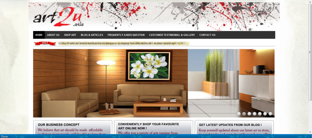
Your Home Page should tell the basic idea of your website
2. JavaScript
There is no doubt that the JavaScript is for good and allows interactivity, yet there are some problems that we tend to face. Despite of the fact that it is a great technology, yet its use is recommendable when it is needed the most. The browsers like IE exploits the security problems, and makes your web page bloated. The JavaScript links ought to be avoided because these links tend to create problem, and since then, their use have been restricted.

3. Avoid Fancy Apparels
Less is more! Sometimes, we have many ideas that we want put into our website, making it more fancy, colourful and stylish; yet we tend to forget the basic essence or message we would like to deliver to our visitors. “Overdressed” website makes the visitors confused. We should bear in mind that most visitors visit your website for information, and readability of the website is important! It is recommended for you to have a theme for your website, which includes the theme colour and font type. Take an example from Twitter, the two theme colours – blue (light & dark) and white is simple yet Recognizable! The font type for your content should not be too fancy too, Arial, Helvetica, Tahoma, and sans-serif fonts are highly recommendable for your web pages.
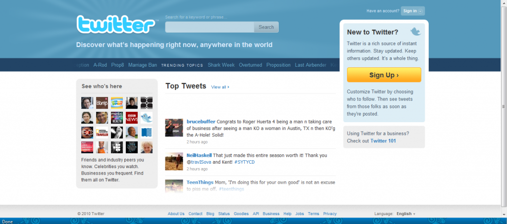
Twitter – good example of using simple theme, yet very recognizable!
4. Never Make Assumptions
Assuming things would screw your rapport badly. This happens when any external link, automatically opens up in a new window discarding the fact how the user wants it. The main point is to provide this liberty to the user itself and allow him/her to open up the link anywhere he/she wants to. This way, you won’t be forcing your page on the visitor.
5. Colour Scheme
As it is said that colour scheme holds a lot of relevance in deciding onto the destiny of your website. A vibrant colour scheme would surely lead your website nowhere, except being a headache. Colours set the mood and they should be used in accordance to the basic idea of your website. For instance, for a environmental-concept website, green is frequently the suitable colour scheme to apply. Besides, your colour scheme should not overshadow the real message of the site – visitors need to see the message, not the colour!
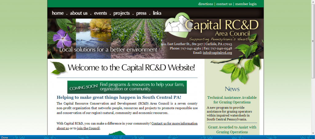
Green Colour Scheme for Environment
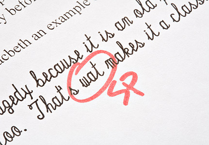
6. Grammatical Errors
Nothing can spare your website’s reputation of the horrifying damages that it would encounter if it contains simple grammatical and typo errors. Make sure that you double check the content before making the website live. You can, at least, check your website content with Microsoft Word’s Spelling and Grammar function (press F7).
7. CAPTCHA is your way
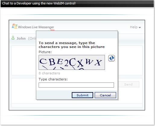
What is CAPTCHA? CAPTCHA stands for Completely Automated Public Turing test to tell Computers and Humans Apart. Still not cleared yet? Maybe the image below can tell you all. Yes, we often see this CAPTCHA while sharing a link on Facebook or sending an email, etc. This CAPTCHA is to ensure that the response is generated by human and to minimize spamming activity. Nowadays, it becomes a necessity to have CAPTCHA filters to be able to reduce the spams that one encounters mainly on the comments and the registration section.
8. Simple Navigation System
Make a clear and simple navigation system, preferably not those drop down menus that hide the information. A straight forward navigation in front of the eye is what the visitor looks out for. Take an example of a web hosting website, if your menu contains several buttons with very similar meaning: Instant Website, Business Email Hosting, Business Hosting – aren’t you making your visitors confused among the three options since they serve almost the same purposes? Keep it simple and clear!
9. Avoid Whatever Turns Out in Excess
“I want a Flash website” – think again! The use of Flashy images and the glittery animation no doubt can bring some excitement to the visitors; however, this “excitement” tends to overshadow the real purpose of the website. In addition, it annoys the visitors at the first place only because it increases the website loading time, and it becomes the biggest turn off. It is recommended that you can still have a simple slideshow on your website – less is more!
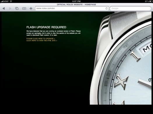
Flash Upgrade Required- you may turn down your potential customers
10. Avoid Unnecessary Registrations
Spare your visitors from the additional headache of registering themselves for any information. Visitors might probably just close your website if you require them to register – you are driving away your potential customers! Try to avoid this procedure unless it serves a purpose and the visitor is willing to do it (such as register for a contest).
11. Special attention to the Link that you provide
Keep in mind the fact that the links that you provide on your webpage are more likely to be visited if the visitor is interested in your site. Just make sure that you highlight them, also that you underline them. In normal situation, link is often underlined and coloured in Blue. This text format might not match with your website theme, but it is so recognizable for decades and it really can tell your visitors the message: “Click this link for more”. Additionally, please make sure all links are linked to the right place!
12. Avail your Footer with some Essentials
It is always recommendable that you provide the footer of the web page with the essential links, so that it avoids the unnecessary effort in scrolling again to the top. Like the example below:
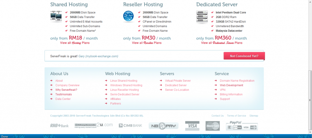
Footer with essential links makes Convenience
13. CSS over HTML
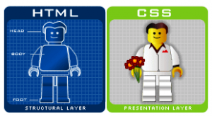
With the advent of CSS, HTML is no more indispensable. HTML is simpler to use, so does its features – simple and too limited. CSS is an easy, fast and reliable option available that is laden with ample of advanced features.
14. Pop-Ups are really not Happening
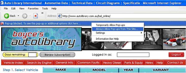
Whether you like it or not, pop-ups (even the flashy and attractive one) are a real source of distractions and annoyance. In addition, most internet browsers (by default) block these pop-ups, and require the visitor’s permission to temporarily allow pop-ups, which again create another hassle to them. The effort seems wasted. Avoid them!
15. Usability Test
It is by far, the most important set of mistake that cannot afford to be overlooked. This is the sole factor that decides on to the quality of your web age in different environments such as Firefox, Opera, IE, Safari, Chrome and many more. We had experienced this once before we launched our new website. We found out that our website is not viewable in Opera. Fortunately, this issue was solved finally, and luckily we realized it before the website is officially launched!
You should test and find out the following before the website is launched:
- Are the images not broken/ disabled/ shrink?
- Is the text readable even after the JavaScript is disabled?
- Is the consistency maintained?
- Is the web page accessible on the individual browser?
Hope the tips above give you a brief idea on “what web design mistakes we should avoid” when starting our very first website. Did you know? You need web hosting to make your designed website available online. Contact us for more information on web hosting: [email protected]
Source & Reference from: Jenny Warner
Jenny is from PixelCrayons, a creative web design and development agency that specializes in custom web design & development, markup services, CMS & E-Commerce solutions.

Hand-picked related articles
Email Spam and Phishing: The Ultimate Security Guide for Businesses
Picture this: It is Monday morning. You sit at your desk, coffee in hand, and open your inbox. Among the…
Ways to Improve Your Site’s Ranking (SEO)
Use these actionable tips to take your SEO to the next level and send your website ranking up to the top of the search engine rankings. Gain more visibility, drive organic traffic, and set your…
Benefits Of SEO
Whether it's a new business or growing one, just think of your business popping up on the first page when…
Who Should Use Shared Hosting
If you fall into any of the categories below, shared server hosting might be suitable for you: 1. Small Businesses…